Live service-business project
Project summary
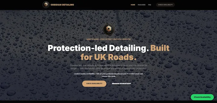
Business
Local detailing business
Goal
Improve trust, package clarity, and local enquiry flow
Focus
Premium positioning, mobile UX, and conversion structure
Live site
detailing.obsidiancreative.uk
What this proves: many local service businesses do not need more visual noise. They need a website that feels more trustworthy, explains the offer more clearly, and reduces hesitation before the enquiry happens.